
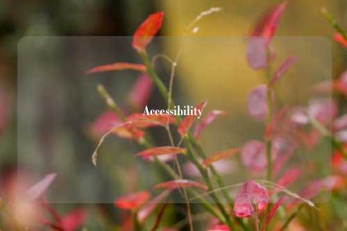
Accessibility技能使用说明
网站无障碍(WCAG 2.1 AA 级)
状态: 可用于生产环境 ✅最后更新: 2026-01-14依赖项: 无(与框架无关)标准: WCAG 2.1 AA 级
快速开始(5分钟)
1. 语义化 HTML 基础
选择正确的元素 - 不要在所有地方都使用div:
<!-- ❌ WRONG - divs with onClick -->
<div onclick="submit()">Submit</div>
<div onclick="navigate()">Next page</div>

<!-- ✅ CORRECT - semantic elements -->
<button type="submit">Submit</button>
<a href="/next">Next page</a>
为何重要:
- 语义元素具有内置的键盘支持
- 屏幕阅读器会自动播报角色
- 浏览器提供默认的无障碍行为
2. 焦点管理
使交互元素支持键盘访问:
/* ❌ WRONG - removes focus outline */
button:focus { outline: none; }

/* ✅ CORRECT - custom accessible outline */
button:focus-visible {
  outline: 2px solid var(--primary);
  outline-offset: 2px;
}
关键:
- 切勿在无替代方案的情况下移除焦点轮廓线
- 使用
focus-visible仅在键盘聚焦时显示 - 确保焦点指示器的对比度达到 3:1
3. 文本替代方案
每个非文本元素都需要一个文本替代方案:
<!-- ❌ WRONG - no alt text -->
<img src="logo.png">
<button><svg>...</svg></button>

<!-- ✅ CORRECT - proper alternatives -->
<img src="logo.png" alt="Company Name">
<button aria-label="Close dialog"><svg>...</svg></button>
无障碍访问五步流程
第一步:选择语义化 HTML
元素选择决策树:
Need clickable element?
├─ Navigates to another page? → <a href="...">
├─ Submits form? → <button type="submit">
├─ Opens dialog? → <button aria-haspopup="dialog">
└─ Other action? → <button type="button">

Grouping content?
├─ Self-contained article? → <article>
├─ Thematic section? → <section>
├─ Navigation links? → <nav>
└─ Supplementary info? → <aside>

Form element?
├─ Text input? → <input type="text">
├─ Multiple choice? → <select> or <input type="radio">
├─ Toggle? → <input type="checkbox"> or <button aria-pressed>
└─ Long text? → <textarea>
参见references/semantic-html.md获取完整指南。
第二步:在需要时添加 ARIA
黄金法则:仅在 HTML 无法表达模式时使用 ARIA。
<!-- ❌ WRONG - unnecessary ARIA -->
<button role="button">Click me</button>  <!-- Button already has role -->

<!-- ✅ CORRECT - ARIA fills semantic gap -->
<div role="dialog" aria-labelledby="title" aria-modal="true">
  <h2 id="title">Confirm action</h2>
  <!-- No HTML dialog yet, so role needed -->
</div>

<!-- ✅ BETTER - Use native HTML when available -->
<dialog aria-labelledby="title">
  <h2 id="title">Confirm action</h2>
</dialog>
常见的 ARIA 模式:
aria-label- 当不存在可见标签时使用aria-labelledby- 引用现有文本作为标签aria-describedby- 附加描述aria-live- 宣布动态更新aria-expanded- 可折叠/展开状态
请参阅references/aria-patterns.md以获取完整模式。
步骤三:实现键盘导航
所有交互元素必须支持键盘访问:
// Tab order management
function Dialog({ onClose }) {
  const dialogRef = useRef<HTMLDivElement>(null);
  const previousFocus = useRef<HTMLElement | null>(null);

  useEffect(() => {
    // Save previous focus
    previousFocus.current = document.activeElement as HTMLElement;

    // Focus first element in dialog
    const firstFocusable = dialogRef.current?.querySelector('button, [href], input, select, textarea, [tabindex]:not([tabindex="-1"])');
    (firstFocusable as HTMLElement)?.focus();

    // Trap focus within dialog
    const handleKeyDown = (e: KeyboardEvent) => {
      if (e.key === 'Escape') onClose();
      if (e.key === 'Tab') {
        // Focus trap logic here
      }
    };

    document.addEventListener('keydown', handleKeyDown);
    return () => {
      document.removeEventListener('keydown', handleKeyDown);
      // Restore focus on close
      previousFocus.current?.focus();
    };
  }, [onClose]);

  return <div ref={dialogRef} role="dialog">...</div>;
}
基本键盘操作模式:
- Tab/Shift+Tab:在可聚焦元素间导航
- Enter/Space:激活按钮/链接
- 方向键:在组件内导航(标签页、菜单)
- Escape:关闭对话框/菜单
- Home/End:跳转至首项/末项
请参阅references/focus-management.md以获取完整模式。
步骤四:确保色彩对比度
WCAG AA 标准要求:
- 常规文本(小于18磅):4.5:1 对比度比率
- 大号文本(18磅以上或14磅加粗):3:1 对比度比率
- UI组件(按钮、边框):3:1 对比度比率
/* ❌ WRONG - insufficient contrast */
:root {
  --background: #ffffff;
  --text: #999999;  /* 2.8:1 - fails WCAG AA */
}

/* ✅ CORRECT - sufficient contrast */
:root {
  --background: #ffffff;
  --text: #595959;  /* 4.6:1 - passes WCAG AA */
}
测试工具:
- 浏览器开发者工具(Chrome/Firefox内置检查器)
- 对比度检查器扩展
- axe DevTools扩展
查看references/color-contrast.md获取完整指南。
步骤5:确保表单可访问
每个表单输入都需要一个可见标签:
<!-- ❌ WRONG - placeholder is not a label -->
<input type="email" placeholder="Email address">

<!-- ✅ CORRECT - proper label -->
<label for="email">Email address</label>
<input type="email" id="email" name="email" required aria-required="true">
错误处理:
<label for="email">Email address</label>
<input
  type="email"
  id="email"
  name="email"
  aria-invalid="true"
  aria-describedby="email-error"
>
<span id="email-error" role="alert">
  Please enter a valid email address
</span>
动态错误的实时区域:
<div role="alert" aria-live="assertive" aria-atomic="true">
  Form submission failed. Please fix the errors above.
</div>
查看references/forms-validation.md获取完整模式。
关键规则
始终做到
✅ 优先使用语义化HTML元素(button、a、nav、article等)
✅ 为所有非文本内容提供文本替代方案
✅ 确保普通文本对比度达4.5:1,大文本/UI元素达3:1
✅ 确保所有功能均可通过键盘访问
✅ 仅使用键盘测试(拔掉鼠标)
✅ 使用屏幕阅读器测试(Windows用NVDA,Mac用VoiceOver)
✅ 使用正确的标题层级(h1 → h2 → h3,不跳级)
✅ 为所有表单输入添加可见标签
✅ 提供焦点指示器(切勿仅使用outline: none)✅ 使用aria-live用于动态内容更新
切勿
❌ 使用div配合onClick来代替button❌ 移除焦点轮廓而不提供替代方案
❌ 仅用颜色来传达信息
❌ 使用占位符作为标签
❌ 跳过标题层级(例如从h1直接到h3)
❌ 使用tabindex> 0(会打乱自然顺序)
❌ 在已有语义化HTML时添加ARIA
❌ 关闭对话框后忘记恢复焦点
❌ 在可聚焦元素上使用role="presentation"❌ 创建键盘陷阱(无法退出)
已知问题预防
此技能可预防12个有记录的可访问性问题:
问题 #1:缺少焦点指示器
错误交互元素没有可见的焦点指示器来源: WCAG 2.4.7(焦点可见)发生原因: CSS重置移除了默认轮廓线预防措施: 始终提供自定义的焦点可见样式
问题 #2:色彩对比度不足
错误: 文本对比度低于4.5:1来源: WCAG 1.4.3(对比度最低要求)发生原因: 在白色背景上使用浅灰色文本预防措施: 使用对比度检查器测试所有文本颜色
问题 #3:缺少替代文本
错误: 图像缺少alt属性来源: WCAG 1.1.1(非文本内容)发生原因忘记添加或认为它是可选的预防措施:对于装饰性图像添加alt="",对于有意义的图像则添加描述性alt文本
问题 #4:键盘导航失效
错误:交互元素无法通过键盘访问来源:WCAG 2.1.1(键盘)发生原因:使用div的onClick事件而非button元素预防措施:使用语义化的交互元素(button、a)
问题 #5:表单输入字段缺少标签
错误:输入字段缺少关联的标签来源:WCAG 3.3.2(标签或说明)发生原因:使用占位符作为标签预防措施:始终使用<label>标签具有for/id关联的元素
问题 #6:标题层级跳跃
错误: 标题层级从h1跳至h3来源: WCAG 1.3.1(信息与关系)原因: 将标题用于视觉样式而非语义结构预防措施: 按顺序使用标题,通过CSS设置样式
问题 #7:对话框缺少焦点锁定
错误: Tab键会使焦点移出对话框至背景内容来源: WCAG 2.4.3(焦点顺序)原因: 未实现焦点锁定机制预防措施: 为模态对话框实现焦点锁定
问题 #8:动态内容缺少aria-live属性
错误: 屏幕阅读器不会播报内容更新来源:WCAG 4.1.3(状态消息)发生原因:动态内容添加时未进行通知预防措施:使用 aria-live="polite" 或 "assertive"
问题 #9:仅通过颜色传达信息
错误:仅使用颜色来传达状态来源:WCAG 1.4.1(颜色的使用)发生原因:仅用红色文字表示错误,未配图标或文字说明预防措施:添加图标和文字标签,而非仅依赖颜色
问题 #10:链接文本描述不清
错误:使用“点击此处”或“了解更多”等链接文本来源:WCAG 2.4.4(链接目的)发生原因:使用缺乏上下文的通用链接文本预防措施使用描述性链接文本或aria-label
问题 #11:媒体自动播放
错误:视频/音频在无用户控制的情况下自动播放来源:WCAG 1.4.2(音频控制)原因:使用了无控制功能的自动播放属性预防措施:要求用户交互以启动媒体
问题 #12:不可访问的自定义控件
错误:自定义选择/复选框无键盘支持来源:WCAG 4.1.2(名称、角色、值)原因:基于div构建但未使用ARIA预防措施:使用原生元素或实现完整的ARIA模式
WCAG 2.1 AA 快速检查清单
可感知性
- 所有图像均有替代文本(或装饰性图像使用alt="")
- 文本对比度≥4.5:1(正常),≥3:1(大号)
- 不单独使用颜色传达信息
- 文本可缩放至200%且内容不丢失
- 自动播放音频不超过3秒
可操作
- 所有功能均可通过键盘访问
- 无键盘陷阱
- 焦点指示器可见
- 用户可暂停/停止/隐藏动态内容
- 页面标题描述用途
- 焦点顺序符合逻辑
- 链接目的通过文本或上下文清晰呈现
- 提供多种页面查找方式(菜单、搜索、站点地图)
- 标题和标签描述用途
可理解
- 页面语言已指定(
<html lang="en">) - 语言变化已标记(
<span lang="es">) - 聚焦或输入时不会发生意外上下文变化
- 全站导航一致性
- 提供表单标签/说明
- 输入错误已识别并描述
- 针对法律/财务/数据变更的错误预防
稳健性
- 有效的HTML(无解析错误)
- 所有UI组件均提供名称、角色、值信息
- 状态消息已标识(aria-live)
测试工作流程
1. 仅键盘测试(5分钟)
1. Unplug mouse or hide cursor
2. Tab through entire page
   - Can you reach all interactive elements?
   - Can you activate all buttons/links?
   - Is focus order logical?
3. Use Enter/Space to activate
4. Use Escape to close dialogs
5. Use arrow keys in menus/tabs
2. 屏幕阅读器测试(10分钟)
NVDA(Windows - 免费):
- 下载:https://www.nvaccess.org/download/
- 启动:Ctrl+Alt+N
- 导航:方向键或Tab键
- 朗读:NVDA+向下箭头
- 停止:NVDA+Q
VoiceOver(Mac - 内置):
- 启动:Cmd+F5
- 导航:VO+右/左箭头(VO = Ctrl+Option)
- 阅读:VO+A(阅读全部)
- 停止:Cmd+F5
测试内容:
- 所有交互元素是否都有语音提示?
- 图片描述是否恰当?
- 表单标签是否与输入框一同朗读?
- 动态更新是否有语音通知?
- 标题结构是否清晰?
3. 自动化测试
axe DevTools(浏览器扩展 - 强烈推荐):
- 安装:Chrome/Firefox扩展
- 运行:F12 → axe DevTools标签 → 扫描
- 修复:审查违规项,遵循修复建议
- 重新测试:修复后再次扫描
Lighthouse(Chrome内置):
- 打开开发者工具(F12)
- Lighthouse标签
- 选择“无障碍”类别
- 生成报告
- 90分以上为良好,100分为理想
常用模式
模式一:无障碍对话框/模态框
interface DialogProps {
  isOpen: boolean;
  onClose: () => void;
  title: string;
  children: React.ReactNode;
}

function Dialog({ isOpen, onClose, title, children }: DialogProps) {
  const dialogRef = useRef<HTMLDivElement>(null);

  useEffect(() => {
    if (!isOpen) return;

    const previousFocus = document.activeElement as HTMLElement;

    // Focus first focusable element
    const firstFocusable = dialogRef.current?.querySelector(
      'button, [href], input, select, textarea, [tabindex]:not([tabindex="-1"])'
    ) as HTMLElement;
    firstFocusable?.focus();

    // Focus trap
    const handleKeyDown = (e: KeyboardEvent) => {
      if (e.key === 'Escape') {
        onClose();
      }
      if (e.key === 'Tab') {
        const focusableElements = dialogRef.current?.querySelectorAll(
          'button, [href], input, select, textarea, [tabindex]:not([tabindex="-1"])'
        );
        if (!focusableElements?.length) return;

        const first = focusableElements[0] as HTMLElement;
        const last = focusableElements[focusableElements.length - 1] as HTMLElement;

        if (e.shiftKey && document.activeElement === first) {
          e.preventDefault();
          last.focus();
        } else if (!e.shiftKey && document.activeElement === last) {
          e.preventDefault();
          first.focus();
        }
      }
    };

    document.addEventListener('keydown', handleKeyDown);

    return () => {
      document.removeEventListener('keydown', handleKeyDown);
      previousFocus?.focus();
    };
  }, [isOpen, onClose]);

  if (!isOpen) return null;

  return (
    <>
      {/* Backdrop */}
      <div
        className="dialog-backdrop"
        onClick={onClose}
        aria-hidden="true"
      />

      {/* Dialog */}
      <div
        ref={dialogRef}
        role="dialog"
        aria-modal="true"
        aria-labelledby="dialog-title"
        className="dialog"
      >
        <h2 id="dialog-title">{title}</h2>
        <div className="dialog-content">{children}</div>
        <button onClick={onClose} aria-label="Close dialog">×</button>
      </div>
    </>
  );
}
使用场景:任何会阻断与背景内容交互的模态对话框或覆盖层。
模式二:无障碍标签页
function Tabs({ tabs }: { tabs: Array<{ label: string; content: React.ReactNode }> }) {
  const [activeIndex, setActiveIndex] = useState(0);

  const handleKeyDown = (e: React.KeyboardEvent, index: number) => {
    if (e.key === 'ArrowLeft') {
      e.preventDefault();
      const newIndex = index === 0 ? tabs.length - 1 : index - 1;
      setActiveIndex(newIndex);
    } else if (e.key === 'ArrowRight') {
      e.preventDefault();
      const newIndex = index === tabs.length - 1 ? 0 : index + 1;
      setActiveIndex(newIndex);
    } else if (e.key === 'Home') {
      e.preventDefault();
      setActiveIndex(0);
    } else if (e.key === 'End') {
      e.preventDefault();
      setActiveIndex(tabs.length - 1);
    }
  };

  return (
    <div>
      <div role="tablist" aria-label="Content tabs">
        {tabs.map((tab, index) => (
          <button
            key={index}
            role="tab"
            aria-selected={activeIndex === index}
            aria-controls={`panel-${index}`}
            id={`tab-${index}`}
            tabIndex={activeIndex === index ? 0 : -1}
            onClick={() => setActiveIndex(index)}
            onKeyDown={(e) => handleKeyDown(e, index)}
          >
            {tab.label}
          </button>
        ))}
      </div>
      {tabs.map((tab, index) => (
        <div
          key={index}
          role="tabpanel"
          id={`panel-${index}`}
          aria-labelledby={`tab-${index}`}
          hidden={activeIndex !== index}
          tabIndex={0}
        >
          {tab.content}
        </div>
      ))}
    </div>
  );
}
使用场景:包含多个面板的标签页界面。
模式三:跳过链接
<!-- Place at very top of body -->
<a href="#main-content" class="skip-link">
  Skip to main content
</a>

<style>
.skip-link {
  position: absolute;
  top: -40px;
  left: 0;
  background: var(--primary);
  color: white;
  padding: 8px 16px;
  z-index: 9999;
}

.skip-link:focus {
  top: 0;
}
</style>

<!-- Then in your layout -->
<main id="main-content" tabindex="-1">
  <!-- Page content -->
</main>
使用场景:所有主内容前包含导航/页头的多页面网站。
模式四:带验证的无障碍表单
function ContactForm() {
  const [errors, setErrors] = useState<Record<string, string>>({});
  const [touched, setTouched] = useState<Record<string, boolean>>({});

  const validateEmail = (email: string) => {
    if (!email) return 'Email is required';
    if (!/^[^\s@]+@[^\s@]+\.[^\s@]+$/.test(email)) return 'Email is invalid';
    return '';
  };

  const handleBlur = (field: string, value: string) => {
    setTouched(prev => ({ ...prev, [field]: true }));
    const error = validateEmail(value);
    setErrors(prev => ({ ...prev, [field]: error }));
  };

  return (
    <form>
      <div>
        <label htmlFor="email">Email address *</label>
        <input
          type="email"
          id="email"
          name="email"
          required
          aria-required="true"
          aria-invalid={touched.email && !!errors.email}
          aria-describedby={errors.email ? 'email-error' : undefined}
          onBlur={(e) => handleBlur('email', e.target.value)}
        />
        {touched.email && errors.email && (
          <span id="email-error" role="alert" className="error">
            {errors.email}
          </span>
        )}
      </div>

      <button type="submit">Submit</button>

      {/* Global form error */}
      <div role="alert" aria-live="assertive" aria-atomic="true">
        {/* Dynamic error message appears here */}
      </div>
    </form>
  );
}
使用场景:所有需要验证的表单。
使用捆绑资源
参考资料 (references/)
深入研究的详细文档:
- wcag-checklist.md- 完整的WCAG 2.1 A级和AA级要求及示例
- semantic-html.md- 元素选择指南,何时使用何种标签
- aria-patterns.md- ARIA角色、状态、属性及其使用场景
- focus-management.md- 焦点顺序、焦点陷阱、焦点恢复模式
- color-contrast.md- 对比度要求、测试工具、调色板技巧
- forms-validation.md- 无障碍表单模式、错误处理、通知播报
Claude应在何时加载这些内容:
- 用户请求完整的WCAG检查清单
- 深入探讨特定模式(标签页、手风琴组件等)
- 色彩对比问题或调色板设计
- 复杂表单验证场景
智能体(agents/)
- a11y-auditor.md- 自动无障碍检测器,用于检查页面违规情况
使用场景:请求对现有页面/组件进行无障碍审计时。
高级主题
ARIA 实时区域
三种礼貌级别:
<!-- Polite: Wait for screen reader to finish current announcement -->
<div aria-live="polite">New messages: 3</div>

<!-- Assertive: Interrupt immediately -->
<div aria-live="assertive" role="alert">
  Error: Form submission failed
</div>

<!-- Off: Don't announce (default) -->
<div aria-live="off">Loading...</div>
最佳实践:
- 使用
礼貌用于非关键更新(通知、计数器) - 使用
断言用于错误和关键警报 - 使用
aria-atomic="true"以在更改时读取整个区域 - 保持消息简洁且有意义
SPA 中的焦点管理
React Router 在导航时不会重置焦点 - 你需要自行处理:
function App() {
  const location = useLocation();
  const mainRef = useRef<HTMLElement>(null);

  useEffect(() => {
    // Focus main content on route change
    mainRef.current?.focus();
    // Announce page title to screen readers
    const title = document.title;
    const announcement = document.createElement('div');
    announcement.setAttribute('role', 'status');
    announcement.setAttribute('aria-live', 'polite');
    announcement.textContent = `Navigated to ${title}`;
    document.body.appendChild(announcement);
    setTimeout(() => announcement.remove(), 1000);
  }, [location.pathname]);

  return <main ref={mainRef} tabIndex={-1} id="main-content">...</main>;
}
无障碍数据表格
<table>
  <caption>Monthly sales by region</caption>
  <thead>
    <tr>
      <th scope="col">Region</th>
      <th scope="col">Q1</th>
      <th scope="col">Q2</th>
    </tr>
  </thead>
  <tbody>
    <tr>
      <th scope="row">North</th>
      <td>$10,000</td>
      <td>$12,000</td>
    </tr>
  </tbody>
</table>
关键属性:
<caption>- 描述表格用途scope="col"- 标识列标题scope="row"- 标识行标题- 将数据单元格与屏幕阅读器的表头相关联
官方文档
- WCAG 2.1:https://www.w3.org/WAI/WCAG21/quickref/
- MDN 无障碍访问:https://developer.mozilla.org/en-US/docs/Web/Accessibility
- ARIA 创作实践:https://www.w3.org/WAI/ARIA/apg/
- WebAIM:https://webaim.org/articles/
- axe DevTools:https://www.deque.com/axe/devtools/
故障排除
问题:焦点指示器不可见
症状:可以通过 Tab 键在页面中导航,但看不到焦点位置原因:CSS 移除了轮廓线或对比度不足解决方案:
*:focus-visible {
  outline: 2px solid var(--primary);
  outline-offset: 2px;
}
问题:屏幕阅读器未播报更新内容
症状:动态内容已更改但无播报原因:未设置 aria-live 区域解决方案:将动态内容包裹在<div aria-live="polite">中,或使用 role="alert"
问题:对话框焦点逃逸至背景元素
症状:Tab 键导航至对话框后方的元素原因:未实现焦点锁定解决方案:实现焦点锁定(参见上方的模式1)
问题:表单错误未播报
症状:视觉错误已显示,但屏幕阅读器未察觉原因:未设置 aria-invalid 或 role="alert"解决方案:使用 aria-invalid + aria-describedby 指向具有 role="alert" 的错误信息
完整设置检查清单
每个页面/组件均需使用:
- 所有交互元素均可通过键盘访问
- 所有可聚焦元素均有可见的焦点指示器
- 图像均有替代文本(装饰性图像则使用 alt="")
- 文本对比度 ≥ 4.5:1(使用 axe 或 Lighthouse 测试)
- 表单输入框均有关联的标签(不仅限于占位符)
- 标题层级逻辑合理(无跳级)
- 页面包含
<html lang="en">或适当的语言设置 - 对话框具有焦点陷阱,并在关闭时恢复焦点
- 动态内容使用 aria-live 或 role="alert"
- 不单独使用颜色传达信息
- 仅使用键盘测试(不使用鼠标)
- 使用屏幕阅读器测试(NVDA 或 VoiceOver)
- 运行 axe DevTools 扫描(0 违规)
- Lighthouse无障碍评分 ≥ 90
有疑问?遇到问题?
- 查看
references/wcag-checklist.md获取完整要求 - 使用
/a11y-auditor代理扫描您的页面 - 运行axe DevTools进行自动化测试
- 使用真实键盘和屏幕阅读器进行测试
标准:WCAG 2.1 AA级测试工具:axe DevTools、Lighthouse、NVDA、VoiceOver成功标准:Lighthouse评分90+,0个严重违规

 微信扫一扫,打赏作者吧~